If you paint in oil you must follow some safety rules, you can find more information here:
http://www.jessbates.com/pages_tutorials/safety.htm
Sunday, April 18, 2010
Monday, April 12, 2010
COLOR HARMONIES
| Complementary Colors that are opposite each other on the color wheel are considered to be complementary colors (example: red and green). The high contrast of complementary colors creates a vibrant look especially when used at full saturation. This color scheme must be managed well so it is not jarring. Complementary colors are tricky to use in large doses, but work well when you want something to stand out. | |
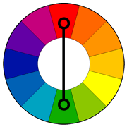  | |
| Analogous color schemes use colors that are next to each other on the color wheel. They usually match well and create serene and comfortable designs.
Analogous color schemes are often found in nature and are harmonious and pleasing to the eye.
Make sure you have enough contrast when choosing an analogous color scheme.
  | |
  Triad
Triadic color harmonies tend to be quite vibrant, even if you use pale or unsaturated versions of your hues.To use a triadic harmony successfully, the colors should be carefully balanced - let one color dominate and use the two others for accent.
| |
Split-Complementary The split-complementary color scheme is a variation of the complementary color scheme. In addition to the base color, it uses the two colors adjacent to its complement. This color scheme has the same strong visual contrast as the complementary color scheme, but has less tension. The split-complimentary color scheme is often a good choice for beginners. | |
  | |
Rectangle (tetradic) The rectangle or tetradic color scheme uses four colors arranged into two complementary pairs. This rich color scheme offers plenty of possibilities for variation. The tetradic color scheme works best if you let one color be dominant. You should also pay attention to the balance between warm and cool colors. | |
 | |
 Square The square color scheme is similar to the rectangle, but with all four colors spaced evenly around the color circle. The square color scheme works best if you let one color be dominant. You should also pay attention to the balance between warm and cool colors. | |
  | |
Sunday, April 11, 2010
PAINTING TECHNIQUES
Terminology
Tone or value is the degree of light or dark in an element. Unless the work is a drawing, or employs only grays, tone also enters into the qualities of a color, along with hue and purity. Tone may create mood (e.g. dark tones for threat or mystery), drama (wide tonal range) or emphasis (highlighting the object of interest).Texture is the visual patterning, and may be abstract (the fluidity of glazes or watercolor) or informative (a silk dress looks very different from one in satin). In the absence of other features, texture may help to create pleasing diversity, to focus interest, and/or impose a necessary unity on the work.
Hue is the color itself, the specific wavelength. Colors create complex physiological and psychological effects in the viewer, and hues are therefore a primary means of obtaining or enhancing the emotional impact of a work.
Color Purity refers to the vibrancy and intensity of a hue, its freedom from admixtures of other hues. Pure colors are colors of a single wavelength, and have the dazzling clarity of stained glass windows — i.e. quite unreal, to be used with the greatest caution. But the infinite gradations possible, combined with tone and hue, makes color purity an expressive device in the hands of a sensitive and experienced painter.
Blending — softening edges of paint after they have been applied, usually with clean brush.
Body Color -Adding white to the colors in the painting, paint given body: dense paint: generally paint made opaque by adding white.
Broken Color-Painting small, disjoint areas of color, as in Impressionism or Pointillism
Chiaroscuro -Depicting boldly contrasting lighting in a painting; also refers to any element of light and shade in an image
Collage - adding other types of media or materials to the oil painting
Dabbing - Using a cloth or sponge on a painting to vary its texture
Dead Color - Using tonal ground work; using black and white; first application in layered technique, either built up subsequently into further layers or into underpainting.
Frottie - complete film of semi—transparent paint, either with glaze or smeared thin.
Grisaille -Painting entirely in monochrome gray; a type of underpainting of an oil painting
Hatching -Applying cross-hatching brush strokes
Impasto -Applying thick paint such that marks and strokes by a brush or knife are visible; for textural effects and glazes
Masking -Using adhesive material to cover an area or create boundaries for where one is currently painting
Painting to Completion in Sections -Performing Alla Prima by section; runs the risk of a disjointed-looking painting if careless
Pulling -Absorbing a surface using a cloth or sponge to "pull" back the underlying surface color
Rubbing -Using fingers to manipulate the paint on the canvas
Scoring -Scratching a painting to reveal an underlying layer; usually done to achieve the effect of creases in skin and hair
Scraping back — paint scraped back to reveal ghost of last application or some of previous.
Spattering -Flicking a brush to transfer the paint on it onto the canvas
Teasing - manipulating paint after it has been set down.
Three-Tone -Using light, medium, and dark tones only
Tonking -Having a sheet of paper absorb excess oil in a painting; named after British artist Henry Tonks
Toned Ground -Applying a stain over a priming (i.e., ground) before one begins to paint;
Underpainting — painting which is designed to combine with later painting (often but not necessarily glazes) to produce desired effect.
Using Ground -Allowing a portion of the ground to see through the finished painting
Varnish -Applying a protective film over a painting that results in either a glossy or matte surface.
Verdaccio - Painting in greenish-gray colors for later layers in an oil painting; a type of underpainting; effective for creating flesh tones; popular among Renaissance artists
Wet-on-wet -Literally wet paint used alongside wet paint; produces a lighter look when the colors mix; "painting from light colors up"; leaves no time for drying up and is thus a quicker method of painting
Wet-on-dry - Literally wet paint used on already dried up paint; traditional approach allowing systematic control
ALLA PRIMA
Alla prima is a style of painting where, instead of building colors up with layers or glazing over an underpainting, the painting is completed while the paint is still wet. Strictly defined, an alla prima painting would be started and finished in one painting session, but the term is also more loosely applied to any painting done in a direct, expressive style, with minimal preparation.
Alla prima comes from Italian, literally meaning "at once". The French term is premier coup.Famous painters who worked in an alla prima style are as diverse as Paul Cezanne, John Singer Sargent, Mary Cassatt, Winslow Homer, Caravaggio, Hieronymus Bosch, and Frans Hals.
PAINTING ON A DARK GROUND
This technique was used by Rembrandt, Velazquez and others for strong chiaroscuro effects. The dark ground serves for shadows, other areas being built up as layers in varying degrees of opaqueness.
FA PRESTO
Fa presto resembles alla prima but there is no preliminary drawing and the paint is applied directly to the ground. The Fa Presto oil painting technique originated in 17th century Italy, and was developed as an offshoot of the 'misch' technique in order to paint a great number of paintings in a short time. As the name implies (fa presto means 'do it quickly') this manner of painting can be used to obtain quick, spontaneous and expressive results as well as more studied works. Starting with an earthen colored imprimatura we paint into wet layers of oil paint and do not have to wait for layers to dry before applying the next layer. By developing a ductus (the way one actually wields the brush) one can bring many structures into play and enhance the artistic expression of the painting considerably. Using a wide variety of brushes the painter can achieve an impressive range of effects.
GLAZING
A glaze in painting refers to a layer of paint, thinned with a medium, so as to become somewhat transparent. Glazing was an important part of old materials and techniques, managed most notably by Titian. Glazes allow pictures to be built up carefully in fine layers, and final color or tonal imbalances to be corrected. Glazing may be used for fine portraiture or any other realist painting. Semi-transparent layers are used one after another to achieve very fine details, give the impression of depth for the eyes, porcelain skin, etc. You must wait for each layer to be fully dry before you start a new layer. You may experiment with various glazing mediums to see what works best for you, some mediums are more fluid, other have a gel consistency. Glazes can be a mixture of linseed oil or poppy oil and turpentine or varnishes. One of the most popular glazing mediums is Liquin Original from Winsor and Newton. In order to minimise the toxicity I use now Winsor and Newton Artisan glazing medium mixed with some Artisan safflower oil.
For painting in acrylics, fine semi-transparent are obtained with various glazing mediums or water.
Here is a good example for glazing, have a look: http://www.explore-drawing-and-painting.com/oil-painting-techniques.html

Elisabeth Vigee-Le Brun
SCUMBLING
Scumbling is a painting technique where a thin or broken layer of color is brushed over another so that patches of the color beneath show through. It can be done with a dry brush, or by removing bits of paint with a cloth.Scumbling is very effective in softening textures. You might use it for soft fabric, young skin, etc. For example, if you are painting a peach, you can scumble its surface to make it look fuzzy.If you use opaque color on top of the dried layer, then it has a semi opaque look. Almost like you add a veil to it. It lightens the color underneath but makes it more chalky.Function Scumbling is a painting or coloring technique where light, opaque colors are placed in thin layers over darker colors to create a softening effect. History Scumbling is a painting technique that has been in existence at least since the 1600s, since the time of the old masters. The famous Dutch painter Rembrandt was known to use this technique, and it can be seen in his works including "Self Portrait" and "Artist Contemplating the Bust of Homer." French painters were also fond of scumbling; for example, David Jacques-Louis used it for portraits such as in his painting "Madame Charles-Louis Trudaine." Effects Scumbling tends to create a glazed or opaque effect. It also builds depth to a picture as it adds layers and textures.
Types Scumbling can be used for several different purposes. It is most often used to soften dark colors by using an opaque or semi-opaque color rubbed over the top of them. It can also be used to blur the lines of a darker picture by brushing a lighter color over them. In some cases, it can bring a dense or opaque color across another, darker color to create texture in a painting. Painters who are creating scenes with sunlight, moonlight or different types of weather might use scumbling to create the effects they are looking for. They may also use it to add a glow to skin tones or different aspects of a room scene.Features In scumbling, a thin layer of opaque color is added to the whole or part of the surface of a brightly colored painting. This then softens the richer colors and gives them a less-clarified look. Because the layer of opaque color is so thin or because sometimes a transparent medium is added to it, the opaque color actually becomes semi-opaque.Misconceptions Scumbling is not the same as glazing. In fact, it is more the opposite of glazing. Glazing is when a layer of paint is thinned by a solvent or lighter pigment color so as to make the whole thing almost transparent and give a texture or gloss to the surface.


SFUMATO
Sfumato - A word, from the Latin fumare ("to smoke"), used to denote a painting technique. Sfumato means that there are no harsh outlines present; areas blend into one another through miniscule brushstrokes, which makes for a rather hazy, albeit more realistic, depiction of light and color. An early, wonderful example of sfumato can be seen in Leonardo's Mona Lisa.cSfumato este un termen, folosit pentru prima dată de Leonardo da Vinci, desemnând o tehnică folosită în pictură care suprapune multiple straturi translucide de culoare ce sunt aplicate în tuşă extrem de subţire, asemănătoare tuşei de culoare folosită în acuarelă, pentru a reda senzaţia de formă, volum şi adâncime.

Termenul de sfumato se mai poate referi, în particular, la o modalitate de amestecare, respectiv de tranziţie a culorilor, atât de fină încât nu se poate distinge vreo zonă de trecere de la o culoare la alta.
În limba italiană cuvântul sfumato înseamnă amestecat, având conotaţii legate de adjectivul fumegos, corespunzător substantivului fum. Leonardo da Vinci descria tehnica folosită şi etichetată de el sfumato ca fiind "fără linii sau delimitări, în maniera fumului sau a a unei imagini nefocalizate."
Unul dintre cele mai bune exemple de folosire a tehnicii sfumato într-o pictură este pictura lui Leonardo însuşi, Mona Lisa.
CHIAROSCURO
Chiaroscuro, simply put, means light and darkness. In painting terms, it denotes the use of deep variations in and subtle gradations of light and shade to create the illusion of three-dimensionality, often to dramatic effect. The Baroque artist Caravaggio was a champion of Chiaroscuro, creating paintings ( Supper at Emmaus, below ) as hauntingly beautiful now as they were 400 years ago.

In comparison the paintings of Caravaggio, Correggio, and, of course, Rembrandt, have a heavy-handed approach to light and shadow. The focus of the painting is illuminated, as if in a spotlight, while the surrounding field is dark and somber – heavy, burnt browns melding to black. This is chiaroscuro, literally "light-dark", a technique which was used to great effect to create dramatic contrasts.

The effect was created using successive glazes of transparent brown. Notorious now, since the brown paints used by the later Renaissance artists tended to be tar based (bitumen) or burnt beechwood (bistre) causes problems in old master paintings by residue seeping through the canvas.
You can create the chiaroscuro effect using glazes of umber (or burnt umber if you want a warmer picture). Remember that if you need to touch up highlights near to the darkened shadow areas, you should warm your colors; add a little red to the mix to make up for the cooling effect of the surrounding darks.
Friday, April 2, 2010
SERAPHINE DE SENLIS
Seraphine de Senlis is a film about an artist, about a soul who shows itself exactly as it is to the world, she's the true genius who makes good home with madness. The end of the film reminds me of another movie, Camille Claudel, the sculptor played by beautiful Adjani (with Rodin played by Depardieu). Camille Claudel is another female artist who ended up in a mental institution. Art becomes a way of living, it actually becomes life itself, and Camille and Seraphine loved, lived and created with the same passion. Sometimes passion is too strong and madness is the refuge, but I cannot blame art for it. I guess we'll never know why some people of genius get mad, and I tend to think that psychiatry still does as much bad today as it did in those times. If only Camille and Seraphine were surrounded by the love they deserved and some recognition for their work, they would have never become so ill in the first place. But people in general have no mercy and understanding for the ones too different from themselves, and the fact that they were women artists in the first half of the last century, made it even more difficult.

I sometimes find myself puzzled when I finish a painting. I keep staring at it for hours, always finding something new to look at. It is the moment I realise it didn't come from me, but from somewhere else, above me. No matter what it is, I retire myself in my studio ignoring the exterior world and let it dominate me, as it comes rarely and it never stays long enough. Seraphine calls it the voice, her angel, and she renounces any minimal material comfort in order to devote herself to it body and soul, with the passion and dedication of a saint. Painting enables her to maintain something vital within herself, and it becomes a way of saving her soul.
Many of her paintings were destroyed, as people didn't think they were valuable in those times, so unfortunately we'll never know all her work. What we know, is that she was much ahead of her time. And what amazes me, is the fact that as soon as she started evolve, she painted on 2 meters tall canvases. This didn't come from Seraphine the cleaner, who was never trained in art or never travelled to see other great artworks, but it came from Seraphine the artist who needed large canvases to express her genius. People who looked for flowers or trees in her paintings felt frightened by them, and though they were still flowers and trees but not the ones you can feel with your senses. Seraphine Louis plants came straight from her inner world.
Subscribe to:
Posts (Atom)
